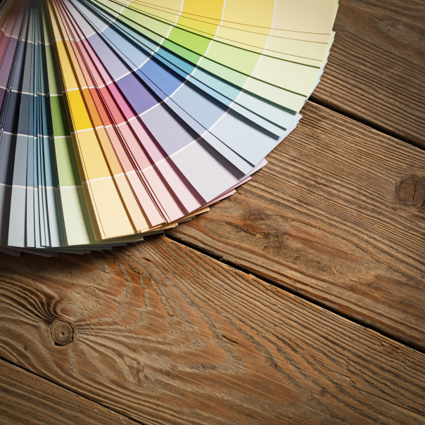
Each year, the global authority on color, PANTONE®, makes our lives just a little bit brighter by declaring an official Color of the Year. Known worldwide as the standard language for color communication to fashion and home styles of all kinds, the Pantone Color Institute has been using leading technologies and systems to determine appropriate color selections since 2000. From the psychedelic ‘60s and earthy ‘70s to the vibrant ‘80s, nuanced ‘90s and expressive ‘00s, the times always seem to directly influence the tones and hues of the world, reflecting overall moods and prominent memories. No matter what the hue, the chosen Color of the Year consistently hits close to home, leaving its radiant mark on residential interiors, future décor choices and even overall states of mind for generations to come.
The recently announced 2016 Color of the Year is especially unique, given that PANTONE named not just one, but two colors, strategically chosen to complement each other for a harmonic sense of balance and peace. Rose Quartz, a light pink, and Serenity, a cool shade of blue, are officially deemed today’s latest color trend, making them the first two colors to ever share this coveted title. PANTONE describes them as “a harmonious pairing of inviting shades that embody a mindset of tranquility and inner peace.” This fresh, somewhat daring approach to setting the color trend for the new year was sparked by the company’s desire to challenge the status quo, and shed a new light on traditional perceptions of color association. “In many parts of the world we are experiencing a gender blur as it relates to fashion, which has in turn impacted color trends throughout all other areas of design,” commented PANTONE. Whether one is sporting a rose-tinted shirt and tranquil blue accessory, or designing a living room to boast the utmost inviting atmosphere, the color pairings support societal movements towards gender equality and an overall positive, uplifting attitude with their gentle and weightless tones, even during turbulent times.

A recent Wall Street Journal article on the topic verified that this color combination will, as always, enter the home, as various décor pieces and products become increasingly available at many local retailers. The fact that there are two colors also encourages interior color combinations, which are expected to be especially prevalent in tablecloths, glassware and ceramics, with paisleys and plaids said to be the predicted patterns of choice.
 If you’re worried that the shades will resemble the colors associated with a baby nursery, fret no more. Apartment Therapy urges individuals to see beyond this stilted judgment, and instead focus on the wealth of possibility Rose Quartz and Serenity provide for the world of interior design. To begin, Rose Quartz is much paler and less shockingly bold than 2014’s Radiant Orchid, already setting a more welcoming, soothing scene. With pastels recently gaining popularity for many homeowners, pink has almost become the new neutral that in turn, offers a favorable array of moods and contrasts when paired with other colors. Additional ways to introduce these colors into your home include throw pillows, linens, wall colors and accent chairs. It’s important to make sure that all selected furniture and accessories are streamlined to create a fresh blend of gender-neutral, sleek and stylish colors.
For more information on the PANTONE 2016 Color of the Year, please visit the company’s website here.