By Molly Kay
Guest Contributor
Whether you’re staging your home to sell, or just want to freshen up your walls for the warmer spring months approaching (check out William Pitt and Julia B. Fee Sotheby’s International Realty’s blog on preparing your home for spring here), we have a few tips to help you pick the right color for your space. Believe it or not, colors play a huge role in influencing our emotions, and the study of this phenomenon is known as color psychology. With that being said, it’s important to know how different colors affect your mood, so that you can better set the tone for each room.
First we’ll start out with the neutrals, which include shades of brown and black. Neutrals are always an easy go-to when choosing a color scheme. They can pair with just about any accent color, and appeal to those who prefer a more subdued tone in their space.
Brown:
Brown brings in a sense of warmth, safety and stability, and is most often associated with earthy tones found in nature. Brown is great to bring into a space through natural wood furnishings, hardwood flooring, or leather upholstered sofas and chairs. Living rooms and dining rooms are ideal for brown hues to evoke a safe atmosphere, as they are the areas in your home where you spend the most time with family. Be sure to balance browns with other earth tones like greens and blues, to avoid inducing feelings of loneliness. When used excessively, it can create a vast and empty atmosphere.

Black:
Black can have a great calming effect and can also promote power and grounding in a space. Pure black is nice when used as an accent, or go for a softer tone like silver to get a more industrial, open feeling in a home office or kitchen. Concrete countertops with stark black metal pendant lighting can bring an urban feel to a suburban home. Silver accents are a great way to offset the darkness brought in through pure, black accents, but allows you to still stay consistent within a dark, neutral color spectrum.

Now we’ll dive into the brighter end of the spectrum, and take a look into red, yellow, blue and green. Introducing vibrant colors into a space can brighten both the room and your mood. These powerful colors work great as statement accent colors.
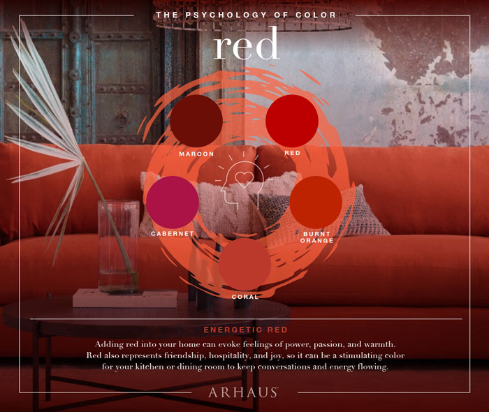
Red:
Red is the powerhouse color on the spectrum, promoting a sense of warmth, passion and high energy. Bringing it into your home can be tricky depending on the shade. Coral is a great shade for a kid’s room or playroom, to help bring in dynamic youthful energy. Coral colored pillows, wall art and furnishings add a great pop of color, and pair beautifully with other vibrant greens and blues, and offset by stark white walls. If you prefer a richer, warmer space, add deeper tones of red to your space, like maroon, through an accent wall, making a living room a cozy space to spend time curled up watching your favorite show.
Yellow:
With summer right around the corner you’ll want to open those windows, and let some much needed sunlight in. If you have limited access to natural light in your home, yellow is a great alternative and can mimic natural hues of the sun. Bring yellow into your space to create a bright, confident and happy atmosphere. It can be straining on the eyes though due to its ability to reflect light, so use it sparingly by adding hints of it in a relatively neutral space. It works well when paired with concrete countertops, white walls, and simple vintage inspired dining room furnishings.

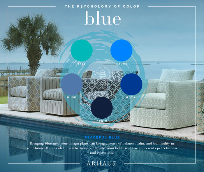
Blue:
Blue is a nice color to bring into a space where relaxation and tranquility are desired. Lighter shades are perfect for a meditation space or nursery with their calming qualities, bringing to mind the serenity of soothing waters or a clear blue sky. Blue is one of the few brighter colors that can be painted on walls, and is not limited to being just an accent color. It pairs beautifully with light natural wood tones, stark white furnishing accessories and light grays. The only place to stay away from blue would be in the kitchen or dining space, as it can have a negative effect on appetite. Royal blue can be distasteful, lowering people’s desire to eat when overly exposed to it.
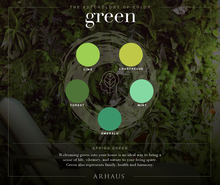
Green:
Green is a refreshing color that, similar to blue, inspires tranquility derived from natural tones. It also promotes good luck and vitality. Both lighter and darker shades of green relieve stress, so bring it into your bedroom or even your work space. If you get stressed working in your office, paint a forest green accent wall, or bring in a green desk chair, or bookshelf. Adding fresh greenery through large plants that help to promote better air quality, can further enhance the calming effects of green hues.